Diplora: Designing the
Clinical Bridge.
Transforming a powerful AI engine into a trusted, clinically validated Triage Console for General Practitioners.
Company
Diplora B.V.
My Role
Lead Product Designer (UX/UI, Brand Strategy, Research).
Timeline
6 Months
Overview
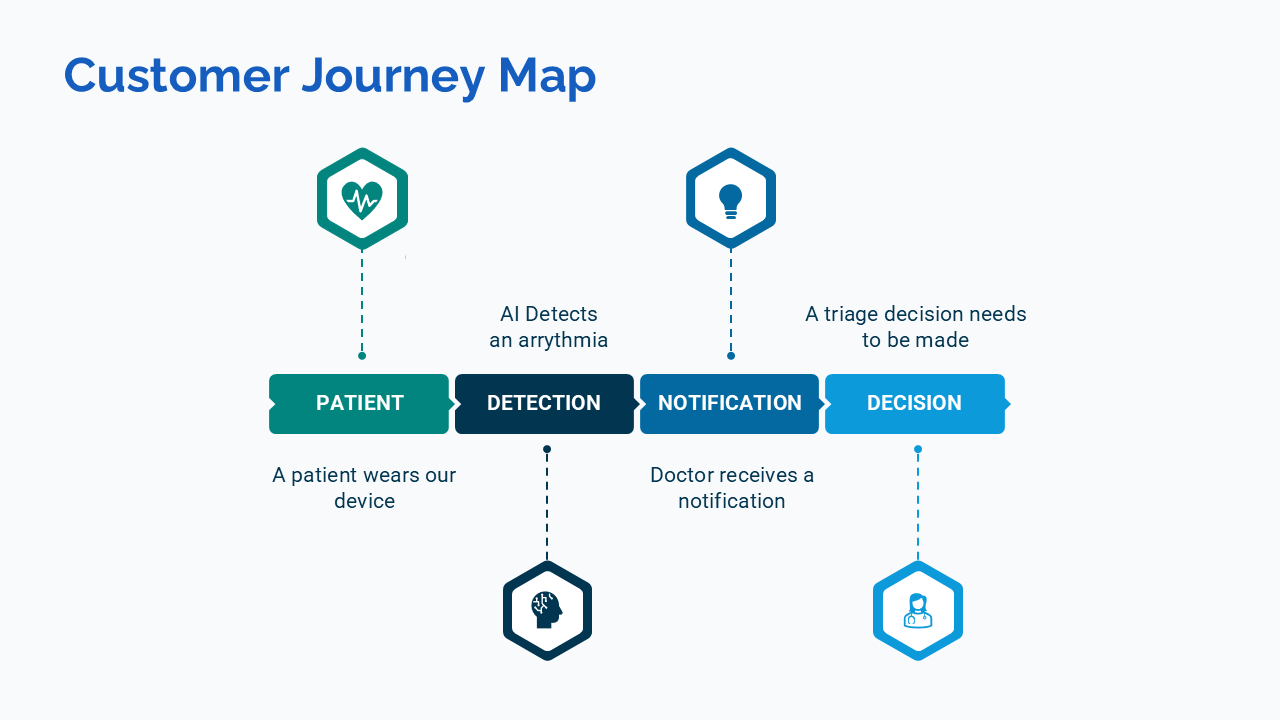
Diplora is a MedTech startup aiming to revolutionize cardiac monitoring. Their AI engine reconstructs a full hospital-grade 12-lead ECG from a simple, wearable 3-lead sensor.
I was brought on as Lead Product Designer to design the vehicle for this powerful engine. The goal was to create a dashboard for General Practitioners (GPs) to review AI-flagged cardiac events and make rapid, safe referral decisions.
Visit Diplora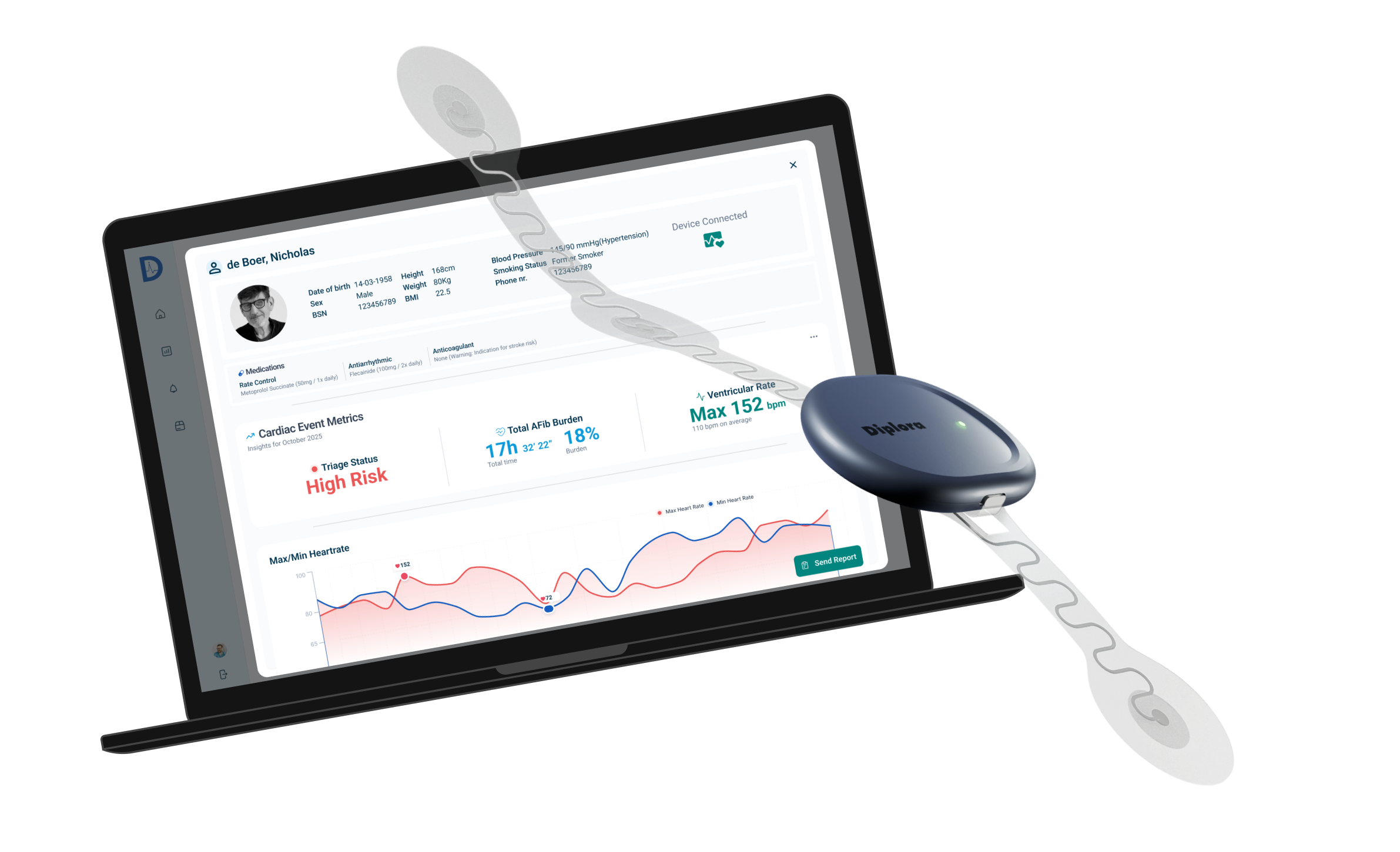
The Foundation
Resolving Internal Dissonance
We had a Ferrari engine, but no steering wheel. Internal stakeholders were completely misaligned on the core value proposition. Was this a diagnostic tool replacing specialists, or a support tool for GPs?
I realized I couldn't design a trusted UI for a brand that didn't know who it was. Design cannot fix a broken strategy. I took the risk of pausing UI work to lead a strategic branding phase.
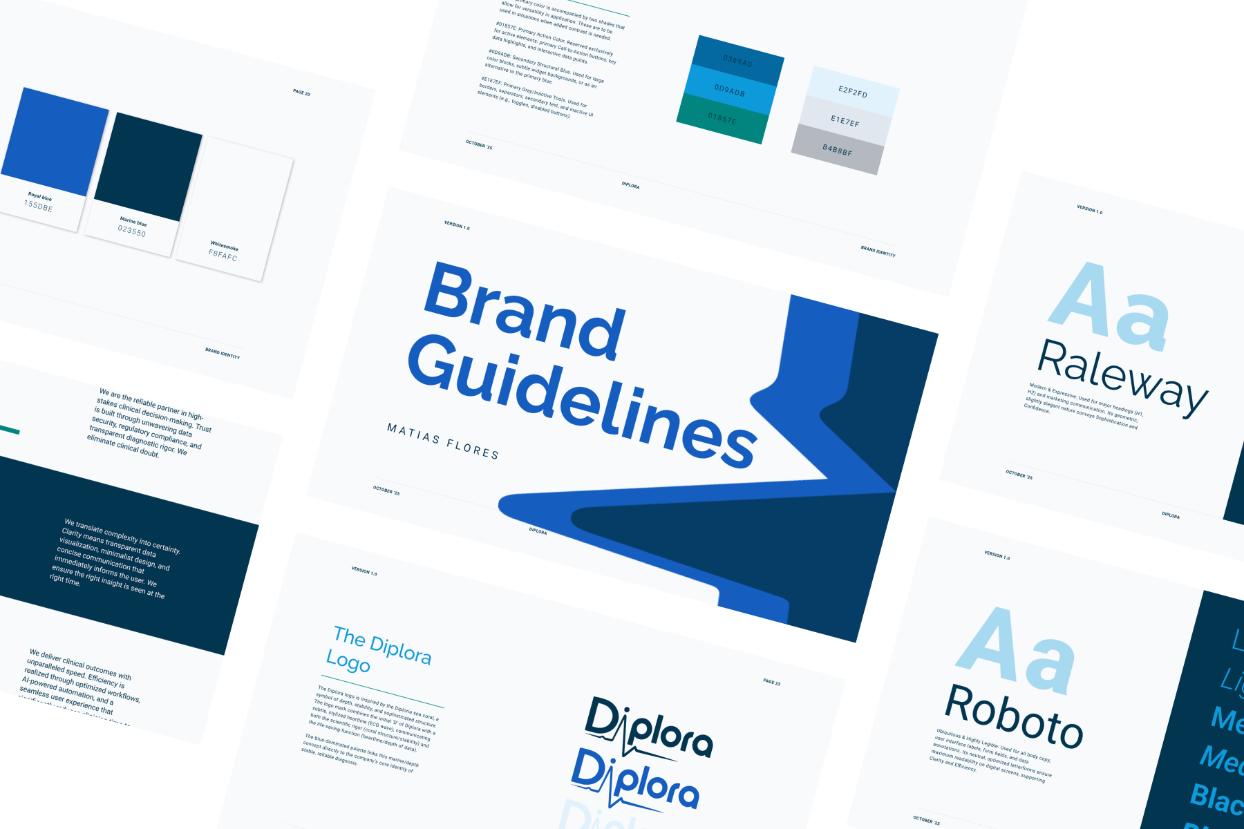
We defined our core value as "Trusted Efficiency." We moved to a visual language rooted in Clinical Blues for authority and stability, utilizing Diplora Coral exclusively to guide the eye to actionable elements without causing "alarm fatigue." This became the constitution for the UI.
The Challenge
The GP Dilemma: "Urgency implies Liability"
General Practitioners are generalists, not ECG analysts. They have exactly 10 minutes per patient. In our primary research workshops, a GP consultant gave me the most critical insight of the project:
"If your AI flags a patient as 'High Risk,' you are handing me a legal burden. I have to act. If I ignore it, I’m liable. If I refer it, I need to defend why."
This insight from our consultant GP helped me reshape the design. Giving a GP a raw ECG graph doesn't help them; it paralyzes their workflow and induces anxiety. They do not need more data—they need defensible clarity.
The Solution
Engineering the "Decision Filter"
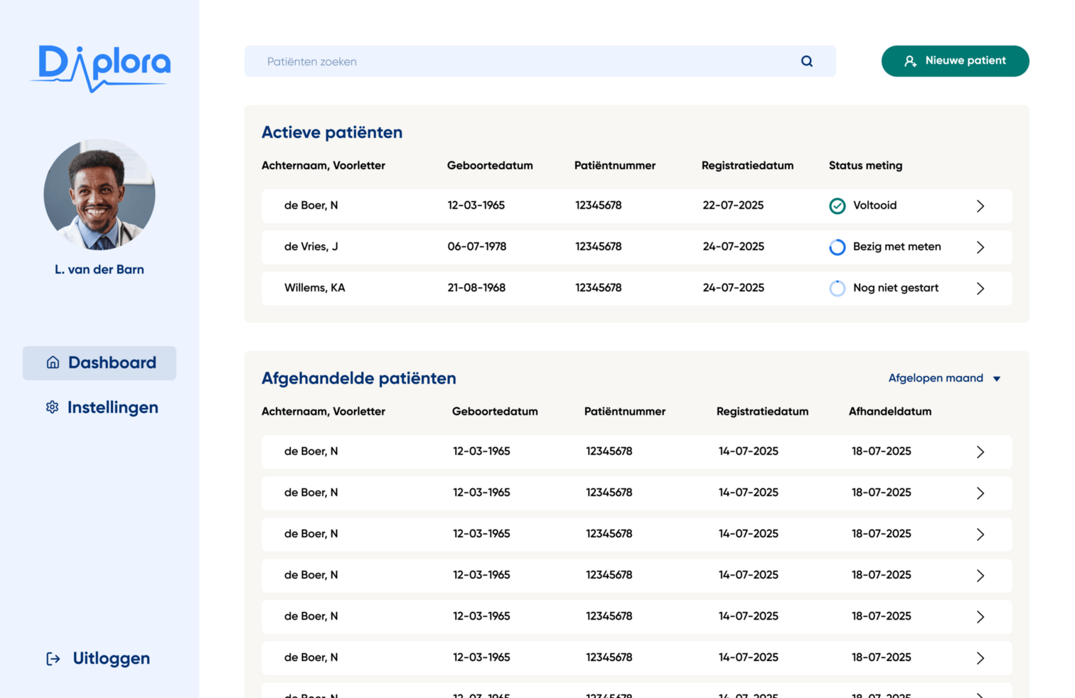
My design philosophy shifted entirely from data presentation to triage support. The interface needed to filter the noise and highlight the signal, allowing a GP to reach a safe, defensible referral decision.
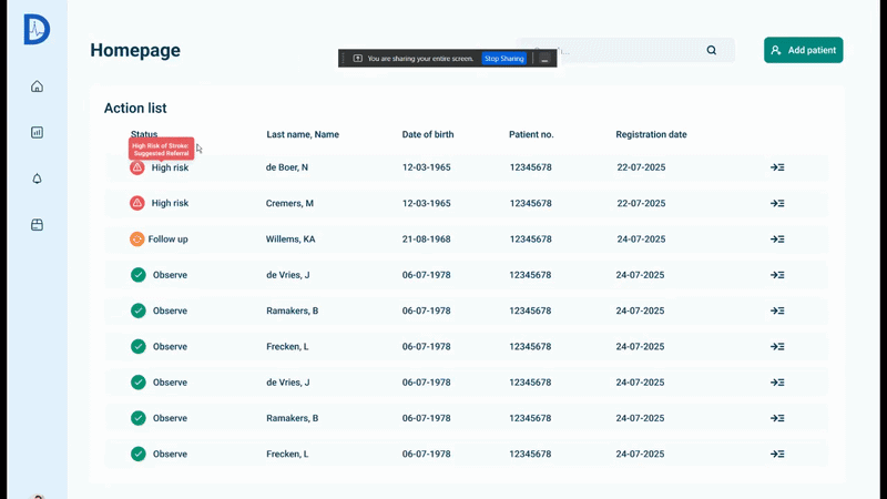
Competitors in the market build "Diagnostic Workbenches"—archives of complex raw data designed for cardiologists. For Diplora, I designed a Decision Filter. The goal wasn't to aid in deep ECG analysis, but to confidently drive a 'Refer' or 'Discharge' decision in under 60 seconds.
The Liability Shield
I designed the Justification Shield. Instead of forcing the GP to interpret a squiggly line, hovering over a red flag provides a plain-text summary (e.g., "High Risk of Stroke - Sustained AFib"). We automated their defense, giving them the exact words needed for a referral letter.

Clinical Context Integration
A heart rate of 50 is alarming—unless the patient is on Beta-Blockers. Based on the proxy testing, I integrated a Medications Sidebar and prioritized Min/Max HR graphs over averages, preventing context-blind referrals and false alarms.
The 60-Second Workflow
The Impact
In the final week of the project, we secured a final validation session with our target GP. The result? She rejected the complex layouts preferred by the Cardiologists in favor of the Unified Action List, validating our core assumption: Workflow efficiency trumps data density.
We started with a fractured concept and a powerful engine. We ended with a clinically validated Triage Console. Diplora is no longer just a technical tool; it is a defensible, safe, and efficient product ready for development.
Strategic Roadmap Handoff
Advised stakeholders to pivot the final product from a standalone web-portal to a HIS (Huisartsen Informatie Systeem) Widget, eliminating the final layer of program-switching friction for doctors.